


Discover our top 10 through concrete cases to improve the performance of your website or your landing page. We’ll talk about key strategies such as improving content readability, navigation, and optimizing calls to action and the conversion journey. By applying these tips, you will be able to deliver a smoother and more engaging user experience, leading to an increasing conversion rate and lasting success for your website.
Our List
1° – Action buttons
2° – Reinsurance
3° – Promotion
4° – The home page
5° – The navigation menu
6° – The product page
7° – The basket page
8° – The conversion tunnel
9° – The conversion tunnel
10° – The conversion form
1° – Action buttons
The action buttons on high-stakes pages are sometimes not highlighted enough and slow down conversion. To facilitate the journey and encourage clicks, their location is essential and can be the subject of AB tests to identify the most suitable location (for example, an action button that appears too quickly may underperform if the user needs to get the information upstream). Desktop and mobile experience / Leads site * Here we have upgraded two CTAs by making them more visible by changing their location and color. This makes it easier for the user to visualize and achieve these goals.
Results for version B:
∙+76% conversion rate
∙+53% click-through rate on main CTA
2° – Reinsurance
Reassurance is essential for any product and service, it is found on key pages of the journey such as the home page, the product pages or the shopping cart. On the latter, reinsurance may concern delivery, returns or even payment security and the different payment methods available. Information that reassures users and is sometimes decisive in the pursuit of the purchasing process. Reviews and testimonials are also particularly important for visitors, these social proofs increase the confidence felt by the user in a product or service. They are found on the home page of a site, but also in the listing pages and product pages.
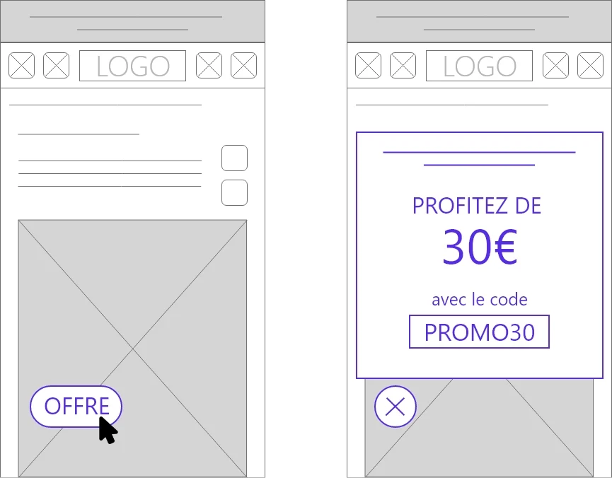
3° – Highlighting promotions
On mobile, traffic can represent an important part, however conversions are not always there. Highlighting promotions is one of the solutions to improve conversion on this medium. Results: + 37% conversion rate on mobile Mobile experience / e-commerce site The objective of the promotion is to encourage mobile visitors to continue their journey. In this case, the promotional offer is triggered during the visitor’s second session when the latter has abandoned a basket.
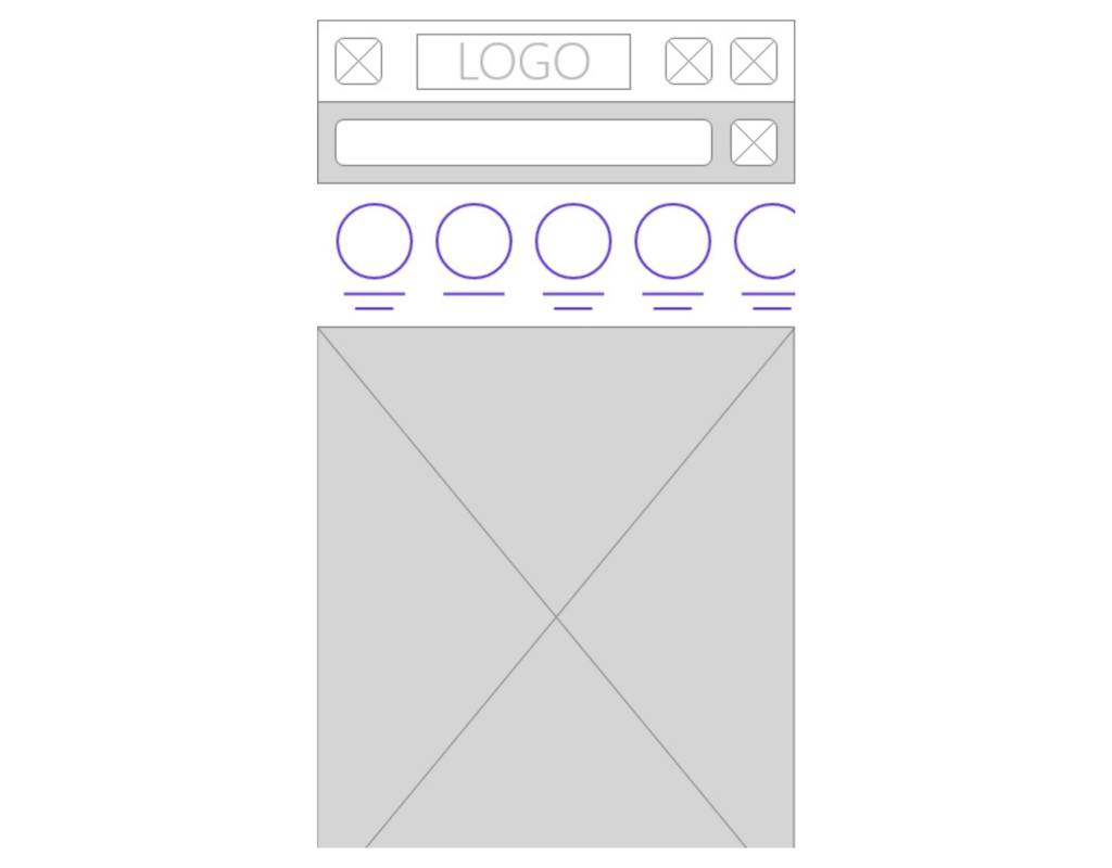
4° – The home page and its first screen
The homepage and its content are of crucial importance for further navigation. Information and access must be clear and offered quickly to visitors, whatever the medium. Mobile experience / E-commerce site * On mobile, navigation is more limited. Through this experience, we have added product categories in swipe to facilitate access.
Results:
∙+78% access to sub-categories
∙-5% bounce rate
5° – The navigation menu
Optimizing its tabs with clear and understandable titles greatly improves navigation as well as the user journey to the objective pages. Even slight changes can greatly increase the click rate, access to certain pages, but also the conversion rate. Desktop and mobile experience / E-commerce site * For this experience, we have replaced the title of one of the main menu tabs with the name “Promotions”. With this more meaningful naming, clicks on this tab and access to pages may have increased significantly. Results: +30% click on the “promotions” link
6° – The product page
The product page is one of the few inevitable pages in the conversion journey on an e-commerce site. It must bring together the essential information and the advantages in order to convince the user to add his product to the basket. Desktop and mobile experience / E-commerce site * In order to reassure the user, we have added elements here near the add to cart button. This made it possible to inform the Internet user at the right time in order to continue the purchase process serenely.
Results:
∙+51% of transactions
∙+ 67% revenue
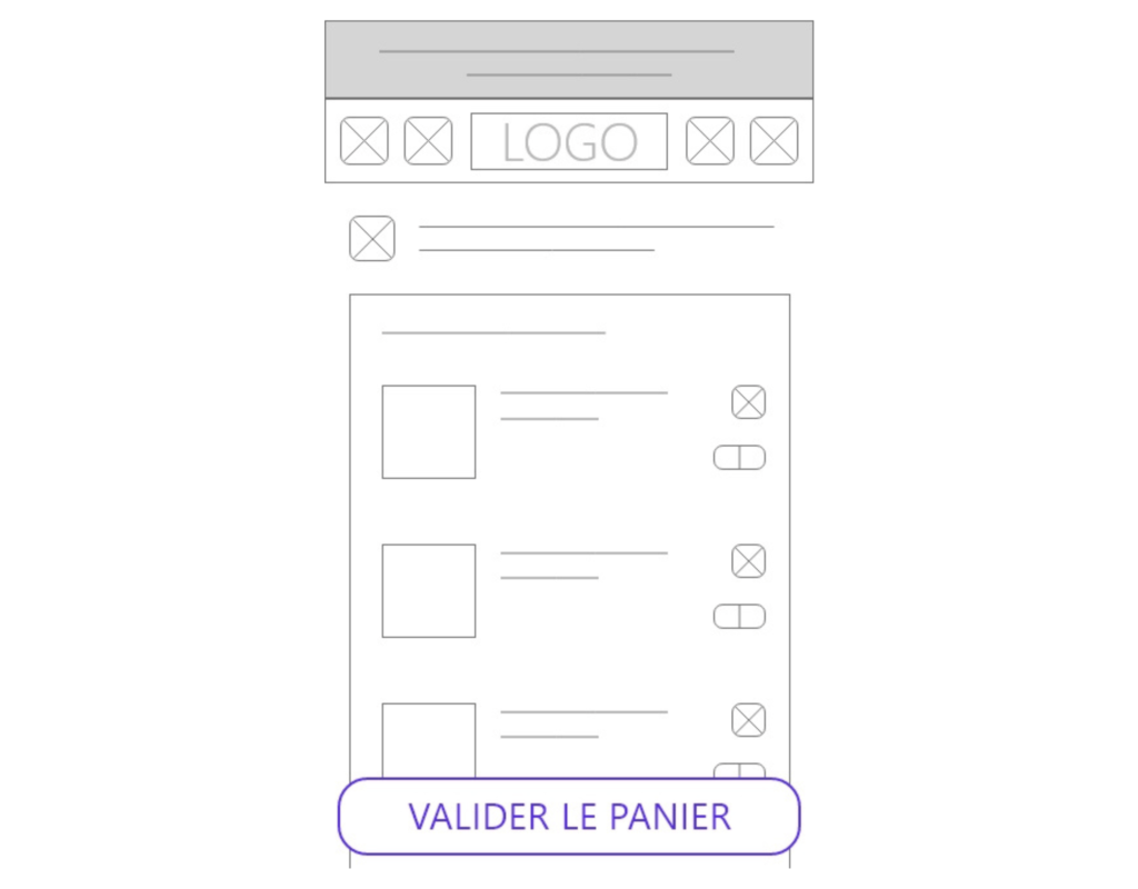
7° – The basket page
On the shopping cart page, it is necessary that the order button is easily accessible. It must be directly visible at the risk of hindering the user’s path to conversion. The objective here is to prioritize this command button on mobile. Mobile experience / E-commerce site * Thanks to the addition of a sticky button, fixed to the scroll, at the bottom of the screen (only when the original button is not visible) the action has become more simple for the visitor.
Results:
∙+9% of transactions recorded
∙+12% of access to the order page
8° – The conversion tunnel
This is the ultimate passage for e-commerce sites before conversion, the structure of the stages of this tunnel is essential to ensure a simple and relevant end of the path for users. It is also in these pages that the departure rate can be very high. One of the optimizations to put in place for the conversion funnel and quarantine. Too often forgotten or incomplete, this is what defines this part of the journey. Almost all outbound links should be hidden to reduce egress and incentivize the user to continue down the tunnel and therefore convert.
9° – Optimize a landing page (LP)
For an LP, optimizing top-of-page elements is crucial. The user must be able to convert without scrolling, so the form must be placed above the fold line. Mobile experience / E-commerce site * A simple action, raising the form to the first reading screen on mobile, could have made the conversion simpler and more direct. Results: +55% conversion rate
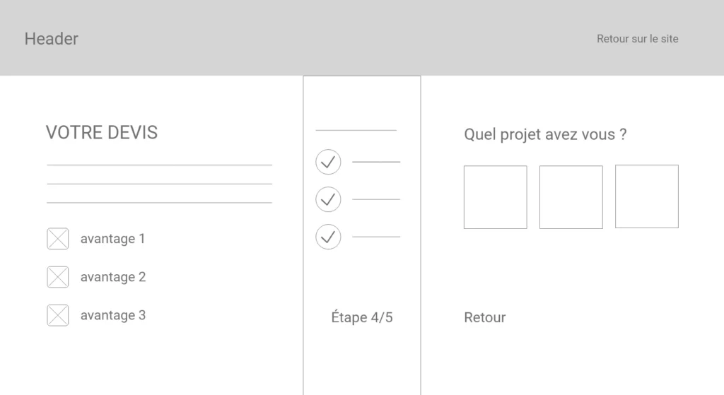
10° – The conversion form
A one-step form is often long and hinders the user to fill it out. However, this step is essential and occurs at the very end of the process before the conversion. Desktop and Mobile Experience / Lead Site * Impressive performance of +233% conversion rate after form structure transformation. Passage from one to several stages in order to optimize its completion and thus facilitate the conversion. Results: ∙+233% conversion rate ∙-40% cost per lead
The 10 examples of optimizations presented above have allowed a sometimes very significant increase in the conversion rate. By applying these concrete cases to your website, you will improve the user experience, the navigation, the structure of your content as well as the conversion performance. Remember that continuous optimization and performance analysis are crucial to maintaining a consistent journey and ever-increasing performance. Thanks to CRO methods, you optimize your conversion rates while improving the profitability of your acquisition campaigns.
* 360°BrandLab cases: the cases and performances presented to you in this article are experiences set up by 360BL